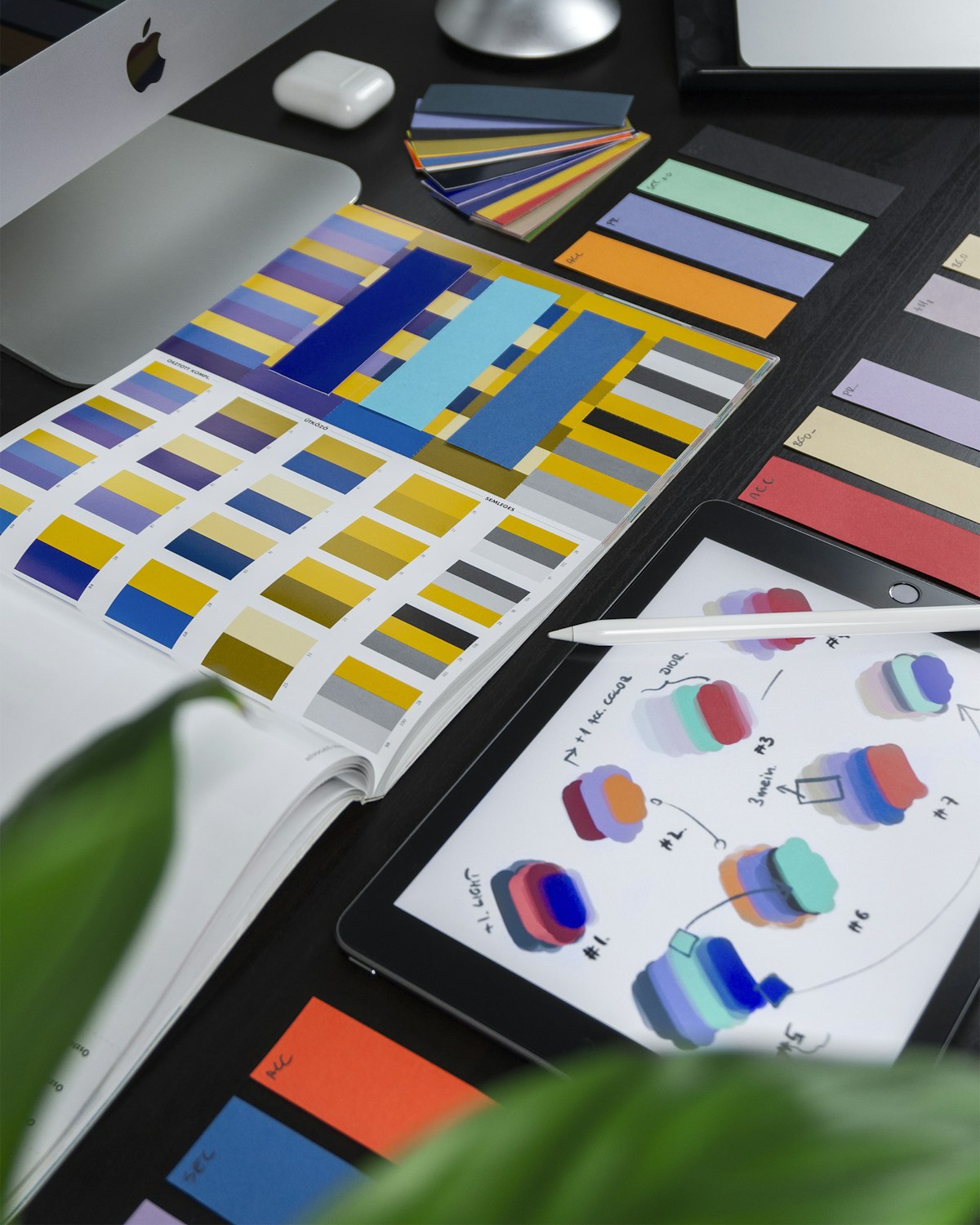
Introduction: The Power of Color in Design
Color is one of the most powerful tools in a designer's arsenal. It can evoke emotions, guide user attention, establish brand identity, and create memorable visual experiences. Understanding color theory—the science and art of using color—is fundamental to creating effective, aesthetically pleasing designs that resonate with your audience. 🌈
Whether you're designing a website, creating a brand identity, developing marketing materials, or crafting user interfaces, color choices significantly impact how your work is perceived and how effectively it communicates. The right color palette can make the difference between a design that falls flat and one that captivates and converts. 💫
This comprehensive guide will walk you through the fundamentals of color theory, explore the psychology behind color choices, introduce you to the most powerful color tools available, and provide practical techniques for applying color effectively in your designs. Whether you're a beginner learning the basics or an experienced designer looking to refine your color skills, this guide will equip you with the knowledge and tools to create stunning, purposeful color palettes. 🎨
💡 Pro Tip
Color is subjective and cultural—what works in one context may not work in another. Always consider your audience, cultural context, and brand guidelines when making color decisions. Test your color choices with real users when possible to ensure they achieve your desired effect.
1. Understanding the Fundamentals of Color Theory
Before diving into practical applications and tools, it's essential to understand the fundamental concepts that underpin color theory. These principles have been refined over centuries and form the foundation for all effective color use in design. 📚
The Color Wheel: Your Visual Guide
The color wheel is a circular diagram that organizes colors based on their chromatic relationships. First developed by Sir Isaac Newton in 1666, it remains the most fundamental tool for understanding color relationships and creating harmonious color schemes. 🎡
Primary Colors
Primary colors are the foundation of all other colors and cannot be created by mixing other colors together:
In traditional color theory (RYB): Red, Yellow, and Blue are the primary colors used in painting and art.
In digital design (RGB): Red, Green, and Blue are the primary colors used in light-based displays.
In printing (CMYK): Cyan, Magenta, Yellow, and Key (Black) are the primary colors used in print production.
Secondary Colors
Secondary colors are created by mixing two primary colors in equal proportions:
Orange
#FF7F00
Red + Yellow
Green
#00FF00
Yellow + Blue
Purple
#8B00FF
Red + Blue
Tertiary Colors
Tertiary colors are created by mixing a primary color with an adjacent secondary color on the color wheel:
- Red-Orange: Vermillion, a vibrant warm color
- Yellow-Orange: Amber, a cheerful warm color
- Yellow-Green: Chartreuse, a fresh energetic color
- Blue-Green: Teal, a sophisticated cool color
- Blue-Purple: Violet, a rich cool color
- Red-Purple: Magenta, a bold vibrant color
Color Properties: Hue, Saturation, and Value
Understanding the three fundamental properties of color is crucial for effective color manipulation and design:
Hue
Hue refers to the pure color itself—what we typically think of as "color." It's the position on the color wheel and is often described by color names like red, blue, or green. Hue is measured in degrees on the color wheel, from 0° to 360°.
Key characteristics of hue:
- Represents the dominant wavelength of light
- Is the most recognizable aspect of color
- Determines the basic color family (red, blue, yellow, etc.)
- Forms the foundation for color schemes and harmonies
Saturation (Chroma)
Saturation describes the intensity or purity of a color—how vivid or muted it appears. A fully saturated color is pure and vibrant, while a desaturated color appears more gray or washed out.
Saturation spectrum:
- High saturation: Vivid, pure, intense colors that grab attention
- Medium saturation: Balanced colors that are vibrant but not overwhelming
- Low saturation: Muted, subtle colors that appear more neutral
- Zero saturation: Pure grayscale—no color information
Design applications:
- High saturation: Call-to-action buttons, emphasis elements, energetic designs
- Low saturation: Backgrounds, professional designs, sophisticated aesthetics
- Mixed saturation: Create depth and hierarchy in designs
Value (Brightness/Lightness)
Value refers to the lightness or darkness of a color—how much white or black has been mixed with the hue. Value is critical for creating contrast, depth, and visual hierarchy.
Value variations:
- Tints: Created by adding white to a hue, making it lighter
- Shades: Created by adding black to a hue, making it darker
- Tones: Created by adding gray to a hue, reducing both brightness and saturation
Design applications:
- High contrast (light vs. dark): Improves readability and accessibility
- Low contrast: Creates subtle, sophisticated effects
- Value gradients: Add depth and dimension to designs
- Monochromatic value variations: Create unified color schemes with depth
Warm vs. Cool Colors
Colors are often categorized as warm or cool based on their psychological associations and visual temperature:
Warm Colors
Warm colors include red, orange, yellow, and variations thereof. They evoke feelings of warmth, energy, and passion.
Psychological effects:
- Create feelings of warmth, comfort, and coziness
- Stimulate energy, excitement, and passion
- Grab attention and create urgency
- Advance visually—appear to come forward
- Increase appetite (commonly used in food branding)
Design applications:
- Call-to-action elements that need to stand out
- Food and beverage industry branding
- Entertainment and creative industries
- Creating energetic, dynamic designs
Cool Colors
Cool colors include blue, green, purple, and their variations. They evoke feelings of calm, professionalism, and tranquility.
Psychological effects:
- Create feelings of calm, peace, and relaxation
- Convey professionalism, trust, and stability
- Recede visually—appear to move backward
- Reduce stress and promote focus
- Associated with water, nature, and sky
Design applications:
- Corporate and professional branding
- Healthcare and wellness industries
- Technology and finance sectors
- Creating calm, trustworthy designs
Color Temperature and Visual Weight
Understanding how colors affect perception of space, depth, and emphasis is crucial for effective design:
Advancing and Receding Colors
Advancing colors: Warm colors, high saturation, and lighter values appear to come forward in space. Use them for elements that need emphasis.
Receding colors: Cool colors, low saturation, and darker values appear to move backward. Use them for backgrounds and supporting elements.
Visual Weight
Different colors carry different visual weight, affecting how users perceive the importance and hierarchy of elements:
- Heavy colors: Dark values, warm hues, high saturation—draw attention
- Light colors: Light values, cool hues, low saturation—recede
- Balance: Distribute visual weight to create balanced, harmonious compositions
90%
Of snap judgments about products are based on color alone
85%
Of consumers cite color as the primary reason for buying a product
80%
Increase in brand recognition attributed to color
42%
Of users judge a website based on color alone
2. Color Harmony: Creating Balanced Color Schemes
Color harmony refers to the pleasing arrangement of colors that creates a sense of order and balance. Understanding color harmony principles allows you to create color schemes that are aesthetically pleasing and functionally effective. 🎼
Types of Color Harmonies
Several established color harmony formulas have been developed based on the color wheel. Each creates a different visual effect and serves different design purposes:
Monochromatic Harmony
A monochromatic color scheme uses variations in lightness and saturation of a single hue. It's the simplest and most unified color harmony.
Characteristics:
- Uses one hue with multiple tints, shades, and tones
- Creates a cohesive, harmonious look
- Easy to create and implement
- Can appear monotonous if not carefully balanced
Best practices:
- Vary the value (lightness/darkness) significantly for contrast
- Use saturation variations to create interest
- Combine with neutrals for balance
- Reserve the most saturated version for emphasis
Design applications:
- Sophisticated, minimalist designs
- Creating a unified brand identity
- Emphasizing photography or content over color
- Professional, elegant aesthetics
Analogous Harmony
An analogous color scheme uses colors that are adjacent to each other on the color wheel (typically three colors within a 90° arc).
Characteristics:
- Uses colors next to each other on the color wheel
- Creates a harmonious, natural feel
- Often seen in nature (sky, water, grass)
- Provides more variety than monochromatic schemes
Best practices:
- Choose one dominant color and use others as accents
- Ensure adequate contrast for readability
- Use warm or cool analogous colors for consistent temperature
- Vary saturation and value for depth
Design applications:
- Nature-inspired designs
- Creating serene, harmonious atmospheres
- Gradient effects and transitions
- Illustrations and artwork
Complementary Harmony
A complementary color scheme uses colors that are directly opposite each other on the color wheel.
Characteristics:
- Uses colors directly opposite on the color wheel
- Creates maximum contrast and visual impact
- Colors intensify each other when placed side by side
- Can be jarring if used in equal proportions
Common complementary pairs:
- Red and Green
- Blue and Orange
- Yellow and Purple
Best practices:
- Use one color as dominant, the other as accent
- Adjust saturation and value to reduce intensity
- Separate complementary colors with neutrals
- Avoid using pure complementary colors in equal amounts
Design applications:
- Creating high contrast and visual interest
- Call-to-action elements
- Sports branding and energetic designs
- Drawing attention to specific elements
Split-Complementary Harmony
A split-complementary scheme uses a base color and the two colors adjacent to its complement.
Characteristics:
- Uses one base color plus two colors adjacent to its complement
- Provides high contrast with more nuance than complementary
- Easier to balance than complementary schemes
- Offers more variety than complementary schemes
Best practices:
- Use the base color as the dominant hue
- Use the split-complementary colors sparingly as accents
- Adjust saturation and value for harmony
- Create hierarchy through color distribution
Design applications:
- Creating visual interest without excessive contrast
- Illustrations and graphics
- Web design with multiple accent colors
- Balanced, dynamic compositions
Triadic Harmony
A triadic color scheme uses three colors evenly spaced around the color wheel (120° apart).
Characteristics:
- Uses three colors equally spaced on the color wheel
- Creates vibrant, balanced color schemes
- Offers high contrast with visual harmony
- Can appear playful or dynamic
Common triadic combinations:
- Red, Yellow, Blue (primary colors)
- Orange, Green, Purple (secondary colors)
- Various tertiary combinations
Best practices:
- Let one color dominate, use others as accents
- Adjust saturation and value for balance
- Use neutrals to separate triadic colors
- Consider the overall balance and weight
Design applications:
- Playful, energetic designs
- Children's products and entertainment
- Creating vibrant, eye-catching visuals
- Illustrations and artwork
Tetradic (Double-Complementary) Harmony
A tetradic color scheme uses two complementary color pairs, forming a rectangle on the color wheel.
Characteristics:
- Uses four colors in two complementary pairs
- Offers the most variety of all color schemes
- Can be challenging to balance
- Provides rich, complex color palettes
Best practices:
- Choose one dominant color
- Use the other three colors as accents
- Be careful not to overwhelm with too much color
- Adjust saturation and value for harmony
- Use neutrals to separate and balance colors
Design applications:
- Complex designs requiring multiple colors
- Large-scale projects with diverse elements
- Creating rich, varied color palettes
- Illustrations and artwork
Square Harmony
A square color scheme uses four colors evenly spaced around the color wheel (90° apart).
Characteristics:
- Similar to tetradic but with equal spacing
- Creates balanced, vibrant color schemes
- Works well with all colors having equal intensity
- Offers variety with balance
Best practices:
- Best used when all colors are desaturated or tinted
- Let one color dominate if using full saturation
- Balance warm and cool colors
- Use neutrals for breathing room
The 60-30-10 Rule
The 60-30-10 rule is a classic design principle for distributing colors in a balanced way:
- 60% Dominant Color: Your main color, typically used for backgrounds and large areas
- 30% Secondary Color: Your supporting color, used for secondary elements and medium areas
- 10% Accent Color: Your emphasis color, used sparingly for call-to-action elements and highlights
Benefits of the 60-30-10 rule:
- Creates visual hierarchy and balance
- Prevents color overwhelm
- Provides a framework for color distribution
- Easy to implement and adjust
- Works with any color harmony system
💡 Pro Tip
Start with a color harmony system, but don't be afraid to adjust. Color theory provides guidelines, not strict rules. Trust your eye and test your color schemes with real content and users. Sometimes breaking the rules creates the most memorable and effective designs.
3. Color Psychology: The Emotional Impact of Color
Colors have profound psychological effects on viewers, influencing emotions, perceptions, and behaviors. Understanding color psychology helps you make strategic color choices that support your design goals and connect with your audience. 🧠
Individual Color Meanings and Associations
Each color carries specific psychological associations and cultural meanings. While these can vary across cultures, some patterns are widely recognized:
Red
Psychological effects: Energy, passion, urgency, excitement, danger, power, love
Positive associations:
- Passion, love, and romance
- Energy, excitement, and intensity
- Strength, power, and determination
- Confidence and boldness
Negative associations:
- Danger, warning, and aggression
- Anger and hostility
- Emergency and urgency
Design applications:
- Call-to-action buttons (creates urgency)
- Sale and clearance promotions
- Food and beverage branding (stimulates appetite)
- Entertainment and gaming
- Sports and fitness brands
Orange
Psychological effects: Enthusiasm, creativity, determination, friendliness, affordability
Positive associations:
- Enthusiasm and excitement
- Creativity and adventure
- Friendliness and sociability
- Warmth and comfort
Negative associations:
- Frivolity or lack of seriousness
- Cheapness or low quality
Design applications:
- Call-to-action buttons (less aggressive than red)
- Creative and artistic brands
- Children's products
- Food and beverage branding
- Technology and innovation
Yellow
Psychological effects: Optimism, happiness, clarity, warmth, caution
Positive associations:
- Happiness, joy, and optimism
- Clarity and intelligence
- Energy and warmth
- Creativity and innovation
Negative associations:
- Caution and warning
- Anxiety or overwhelm (when overused)
- Cowardice or weakness
Design applications:
- Highlighting important information
- Children's products and services
- Food branding (stimulates appetite)
- Optimistic, cheerful brands
- Warning signs and alerts
Green
Psychological effects: Nature, growth, harmony, freshness, safety, prosperity
Positive associations:
- Nature, environment, and sustainability
- Growth, renewal, and freshness
- Health and wellness
- Prosperity and wealth
- Balance and harmony
Negative associations:
- Envy and jealousy
- Inexperience or naivety
Design applications:
- Environmental and eco-friendly brands
- Health, wellness, and organic products
- Financial services (prosperity)
- Confirmation messages and success states
- Natural and organic products
Blue
Psychological effects: Trust, calmness, professionalism, stability, security
Positive associations:
- Trust, reliability, and loyalty
- Professionalism and authority
- Calmness and serenity
- Intelligence and logic
- Stability and confidence
Negative associations:
- Coldness and distance
- Depression or sadness
Design applications:
- Corporate and professional branding
- Technology companies
- Financial institutions
- Healthcare and medical services
- Social media platforms
Purple
Psychological effects: Luxury, creativity, wisdom, spirituality, royalty
Positive associations:
- Luxury, wealth, and sophistication
- Creativity and imagination
- Wisdom and spirituality
- Royalty and prestige
- Mystery and magic
Negative associations:
- Arrogance or pretentiousness
- Immaturty or excess
Design applications:
- Luxury and premium brands
- Beauty and cosmetics
- Creative and artistic services
- Spiritual and wellness brands
- Youth-oriented products
Pink
Psychological effects: Love, compassion, playfulness, femininity, youthfulness
Positive associations:
- Love, romance, and compassion
- Gentleness and nurturing
- Playfulness and fun
- Youthfulness and innocence
Negative associations:
- Excessive femininity or stereotyping
- Weakness or passivity
- Immaturity
Design applications:
- Beauty and cosmetics
- Children's products (especially for girls)
- Romance and wedding services
- Health and wellness (softer approach)
- Modern, playful brands
Black
Psychological effects: Sophistication, power, elegance, mystery, formality
Positive associations:
- Sophistication and elegance
- Power and authority
- Formality and professionalism
- Mystery and intrigue
- Timelessness and classic style
Negative associations:
- Darkness and evil
- Death and mourning
- Heaviness and oppression
Design applications:
- Luxury and premium brands
- Fashion and high-end products
- Technology and modern design
- Typography and text
- Creating contrast and emphasis
White
Psychological effects: Purity, cleanliness, simplicity, innocence, minimalism
Positive associations:
- Purity and innocence
- Cleanliness and hygiene
- Simplicity and minimalism
- Peace and neutrality
- Space and openness
Negative associations:
- Emptiness or sterility
- Coldness or isolation
Design applications:
- Minimalist and modern designs
- Healthcare and medical services
- Weddings and celebrations
- Backgrounds and negative space
- Apple-style tech aesthetics
Gray
Psychological effects: Neutrality, balance, professionalism, sophistication, timelessness
Positive associations:
- Neutrality and balance
- Professionalism and formality
- Sophistication and maturity
- Timelessness and stability
Negative associations:
- Dullness or boredom
- Lack of emotion or energy
- Depression or gloom
Design applications:
- Professional and corporate designs
- Technology and industrial products
- Minimalist aesthetics
- Supporting colors and neutrals
- Typography and text
Cultural Variations in Color Meaning
It's crucial to understand that color meanings can vary significantly across cultures:
Examples of cultural color variations:
- White: Purity and weddings in Western cultures, mourning and funerals in many Eastern cultures
- Red: Danger in Western cultures, good luck and celebration in Chinese culture
- Yellow: Optimism in Western cultures, courage in Japan, mourning in Egypt
- Purple: Royalty in Western cultures, mourning in Thailand and Brazil
- Green: Nature in Western cultures, religion in Islamic countries
Best practices for global designs:
- Research color meanings in your target markets
- Test color choices with local audiences when possible
- Be flexible and willing to adapt colors for different regions
- Consult with local design professionals or cultural experts
- Consider creating region-specific color variations
4. Essential Color Tools for Designers
Modern designers have access to powerful digital tools that simplify color selection, palette creation, and color management. These tools can significantly improve your workflow and help you create more effective color schemes. 🛠️
Color Palette Generators
Color palette generators help you create harmonious color schemes based on color theory principles:
Color Accessibility Tools
Ensuring your color choices are accessible to all users, including those with color vision deficiencies, is crucial:
Color Extraction and Inspiration Tools
These tools help you extract colors from images and find inspiration from the world around you:
| Tool |
Best For |
Key Feature |
Price |
| Adobe Color |
Professional designers |
Creative Cloud integration |
Free (Adobe account) |
| Coolors |
Quick palette generation |
Super fast workflow |
Free / Pro $3/month |
| Paletton |
Advanced color theory |
UI mockup previews |
Free |
| ColorHunt |
Finding inspiration |
Curated collections |
Free |
| Khroma |
Personalized recommendations |
AI-powered learning |
Free |
| WebAIM Contrast Checker |
Accessibility testing |
WCAG compliance |
Free |
| Stark |
Design tool integration |
Comprehensive accessibility |
Free / Pro $12/month |
Ready to Master Color Theory?
Start experimenting with these color tools today and discover how the right color choices can transform your designs. Remember, practice makes perfect!
Explore More Design Tools
5. Practical Applications: Using Color Effectively
Understanding color theory and having the right tools is just the beginning. The real skill lies in applying color effectively in your designs. Let's explore practical techniques for different design contexts. 🎯
Color in Web Design
Web design presents unique color challenges and opportunities:
Creating Visual Hierarchy with Color
Use color to guide users' attention and create a clear hierarchy:
- Primary actions: Use your accent color (typically your brand's primary color) for main call-to-action buttons
- Secondary actions: Use less saturated or lighter versions for secondary buttons
- Navigation: Use neutral colors that don't compete with content
- Content: Use readable, accessible text colors with sufficient contrast
- Background: Use light, neutral backgrounds that don't overwhelm content
Responsive Color Considerations
Colors can appear differently on various devices and screens:
- Test colors on multiple devices (desktop, tablet, mobile)
- Consider how colors appear in different lighting conditions
- Account for screen brightness and color temperature variations
- Ensure sufficient contrast for outdoor viewing
- Test with color calibrated monitors when possible
Dark Mode Considerations
Many users prefer dark mode, requiring alternative color palettes:
- Create a complementary dark mode palette
- Adjust saturation and brightness for dark backgrounds
- Maintain brand recognition across both modes
- Ensure accessibility in both light and dark modes
- Test readability and eye strain
Color in Branding and Identity
Color is a powerful tool for building brand recognition and identity:
Developing a Brand Color Palette
Create a comprehensive brand color system:
- Primary brand color: The main color that represents your brand
- Secondary colors: Supporting colors that complement the primary
- Accent colors: Colors for emphasis and call-to-action
- Neutral colors: Grays, blacks, whites for typography and backgrounds
- Semantic colors: Colors for success, warning, error, and information states
Maintaining Brand Consistency
Ensure consistent color use across all touchpoints:
- Document exact color values (hex, RGB, CMYK, Pantone)
- Create brand guidelines with color usage rules
- Provide examples of correct and incorrect color usage
- Specify color proportions and hierarchies
- Include accessibility guidelines
Color in UI/UX Design
User interface design requires careful color consideration for usability:
Establishing a Color System
Create a systematic approach to color in your UI:
- Define color roles (primary, secondary, accent, semantic)
- Create tint and shade scales for each color
- Establish color usage rules and patterns
- Document hover, active, and disabled states
- Create a color token system for consistency
Semantic Color Usage
Use color meaningfully to communicate state and status:
- Success: Green for positive actions and confirmations
- Warning: Yellow/orange for caution and important information
- Error: Red for errors, alerts, and destructive actions
- Information: Blue for neutral information and tips
- Disabled: Gray for inactive or unavailable options
Color Accessibility Best Practices
Ensuring your color choices are accessible to all users is not just good design—it's essential:
WCAG Contrast Requirements
Meet Web Content Accessibility Guidelines for color contrast:
- Level AA (minimum): 4.5:1 for normal text, 3:1 for large text
- Level AAA (enhanced): 7:1 for normal text, 4.5:1 for large text
- UI components: 3:1 contrast ratio for interactive elements
- Graphical objects: 3:1 contrast for meaningful graphics
Don't Rely on Color Alone
Use multiple visual indicators to convey information:
- Combine color with icons for status indicators
- Use patterns or textures in addition to color
- Add text labels to clarify meaning
- Use shape and position to differentiate elements
- Provide alternative ways to access information
Test with Color Blindness Simulators
Verify your designs work for users with color vision deficiencies:
- Test with protanopia (red-blind) simulation
- Test with deuteranopia (green-blind) simulation
- Test with tritanopia (blue-blind) simulation
- Verify all information is still accessible
- Make adjustments based on testing results
💡 Pro Tip
When in doubt, test with real users. Color perception is subjective and can vary based on individual differences, cultural background, and viewing context. User testing provides invaluable insights that no tool or theory can fully replace. Always validate your color choices with your target audience.
Conclusion: Mastering Color in Your Design Practice
Color is one of the most powerful tools in a designer's toolkit. By understanding color theory fundamentals, leveraging the psychology of color, using the right tools, and applying best practices, you can create designs that not only look beautiful but also communicate effectively and achieve your goals. 🌟
Key Takeaways
- Master the fundamentals: Understanding the color wheel, color properties, and harmony principles provides a solid foundation for all color work
- Consider psychology and culture: Colors carry meaning and evoke emotions—use this power strategically and consider cultural contexts
- Use the right tools: Modern color tools can significantly improve your workflow and help you create better color palettes
- Prioritize accessibility: Ensure your color choices are accessible to all users, including those with color vision deficiencies
- Practice and experiment: Like any skill, color proficiency comes with practice—experiment, test, and learn from your results
- Stay inspired: Continuously seek inspiration from nature, art, photography, and other designs
Continue Your Color Journey
Color theory is vast and continuously evolving. To deepen your understanding and improve your skills:
- Study great designs and analyze their color choices
- Practice creating color palettes for different contexts and purposes
- Stay updated on color trends while maintaining timeless principles
- Collect inspiration and build a personal color library
- Experiment with unconventional color combinations
- Get feedback from other designers and users
- Continue learning through books, courses, and practice
Remember, while color theory provides valuable guidelines and principles, it's not about rigid rules. The most memorable and effective designs often come from understanding the principles deeply enough to know when and how to break them creatively. Trust your instincts, test your choices, and always keep your users and goals in mind. 🎨✨
Sarah Martinez
Senior UI/UX Designer & Color Theory Specialist at Free SEO Tools


Leave a Comment